Whether for a designate/beginner webmaster or for a business who writes his specifications, the choice of colors of a website, a flyer, a business card, a poster or a brochure is a decisive and central exercise, both in terms of ergonomics and user experience than that of the marketing. So we will see how to choose good colors depending on the theme addressed by your website or your print and the intended target. You will see that nothing should be left to chance at this level, otherwise your communication would lose credibility.
Choose a limited number of colors
This tip is an open secret for fashion or interior design lovers. Except for exceptional and original clothing styles falling under the peacocking, the colors should not be too numerous if we do not want to project a messy and immature image. For a website, we will prefer to decline the graphics on two, three or four tones, rather than 6 or 8 colors which will surely give your site an amateur image.
Sobriety And minimalism for serious institutional sites are therefore not too much!
Prioritize clarity
Aesthetics and originality are good. There clarity, it's not bad sometimes too! With the exception of special/baroque/zany communications operations, a website or one classic print must above all satisfy the user experience: no aggressive wallpaper having a color similar to the font, no too many colors in the text, etc.
Show proof of empathy, put yourself in the place of the Internet user for example, and ask yourself what they expect from a medium. For example, for a practical and informational website, it is the text, image and video that must be the center of attention. So make sure to offer the information in the purest way possible, by choosing pale or pastel colors for the background or on the sides, and dark for the text.
Use the color wheel to help yourself
If you are new to web design, or want to communicate credible specifications to your graphic designer, here is a tool that will be very useful for you to choose the colors of your site: the color wheel.
Clearly, you have two major possibilities for combining colors via the color wheel, based on the physical properties of the human eye.
- The first is to choose several shades of the same color. Indeed, neighboring colors on the color diagram create a sensation of balance for the eye.
- The second is to choose opposite colors on the color wheel. So, if you choose two colors for your site, you are taking two diametrically opposed colors. If you take three, you choose three colors based on an equilateral triangle drawn in the center of the color wheel. For four colors, you base yourself on a square. Example: pink and green, dark blue and yellow, orange and light blue, etc…

The colors depend on the emotion to be aroused
- If you want to establish an atmosphere of unity, harmony and candy, it will be preferable to choose neighboring colors. We will opt for reassuring and cold colors such as blue or green for example.
- If your marketing imposes a more energetic, then favor the complementary colors on the color wheel, except for the pairing of text color and background color.
- If you are in a aggressive communications operation, and you are looking to draw attention of the visitor, then favor the warm colors (red, orange, yellow) which will have the effect of arousing emotion, dynamism, warmth, useful for themes such as entertainment, travel or competitions.
Choose colors based on their meaning
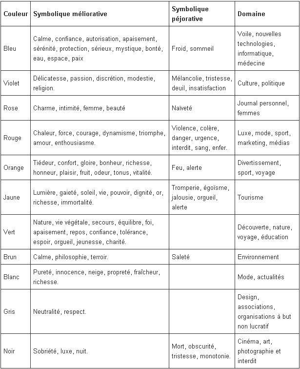
This excellent table taken from the site Commentcamarche.net you list them color meanings accompanied by their positive and negative symbolism, while affiliating them to particular areas of activity. Very useful for making the choice of your colors congruent with the sector in which you are positioned!

As you can see :
- blue evokes serenity and seriousness, and is suitable for the fields of IT, medicine, etc.
- Purple evokes passion, and is adapted to culture, politics but also sometimes to gastronomy or luxury.
- Red can also evoke passion and love, but also strength, dynamism, and works with luxury, sport or the media.
- Orange evokes pleasure, wealth and vitality, and can be used for entertainment, sports, travel, etc.
- Yellow evokes light, sunshine, life, cheerfulness and works well with tourism in particular.
- Green evokes nature and works well with discovery, nature, travel and education.
- Brown can evoke the terroir, but also calm and philosophy, and can work with e-commerce sites oriented towards natural products, but also sites linked to ecology and the environment.
- White evokes purity and art, and works with fashion, luxury, sometimes current affairs because white is neutral.
- Gray also evokes neutrality, respect, art sometimes, and can be used for associations.
- Finally, black evokes sobriety, luxury, night, art and also seriousness. It can be used for cinema and the arts in general, photography for example, but also for niche information sites, training sites, and finally, adult sites.
Bonus: here is an infographic in English on the meaning of colors in brand logos:

Sources:
http://www.commentcamarche.net/contents/web/webdesign.php3
http://ergonomie-web.studiovitamine.com/couleur-web,362,fr.html
http://fr.locita.com/technologie-2/web/infographie-la-signification-des-couleurs-des-logos-de-marques/


One Response
Hi I am very proud of your site
THANKS